An Ode to the Museum Label
After many years of appreciating from afar, I finally visited the Isabella Stewart Gardner Museum in Boston, MA, last month. Named after its founder, the Gardner Museum is a marvel of different artistic movements displayed through its collection and architecture.
One detail I was unaware of before my visit is that the objects in the museum’s main building lack labels. Gardner made this choice when she opened the museum to the public in 1903. She also stipulated in her will that “nothing in the galleries should be changed, and no items be acquired or sold from the collection.” Throughout the museum’s existence, the staff has tried to keep things as close to Gardner’s original vision as possible and worked around this in a few different ways: the museum brochure, which features a few artwork highlights on each gallery floor, and QR codes on signs in the galleries that provide information about the objects in each room.
Having little to no information about the objects readily available on a label was new to me. I like reading labels to get additional context about an object or at least learn its title. When I see a painting that catches my attention, I like to take my time looking at it, glance over and read the label, and return to the painting with new details in mind. I dislike having to dig around in my purse searching for my phone every time I want to learn more about a painting, and I rarely want to scan a QR code.
Upon entering the museum, I grabbed a brochure but didn't look inside until days after my visit (I like to collect them), and it wasn’t until the end of my visit that I discovered signage with QR codes in the galleries. Luckily, I have been a fan of many of the highlighted artworks featured in the museum for years and knew what I wanted to see ahead of time, so I didn’t feel as though I had missed out on any additional insights.
However, the Gardner Museum’s lack of labels made me wonder how a casual, quick-trip visitor might feel—would they seek out more information about works they were interested in, or would they glance and move on? I know that the general understanding in museums is “visitors don’t read labels,” but does that mean there shouldn’t be any labels?
I don’t have a solution for the Gardner Museum’s unique situation, but I would like to advocate for museum labels and their significance to visitors.
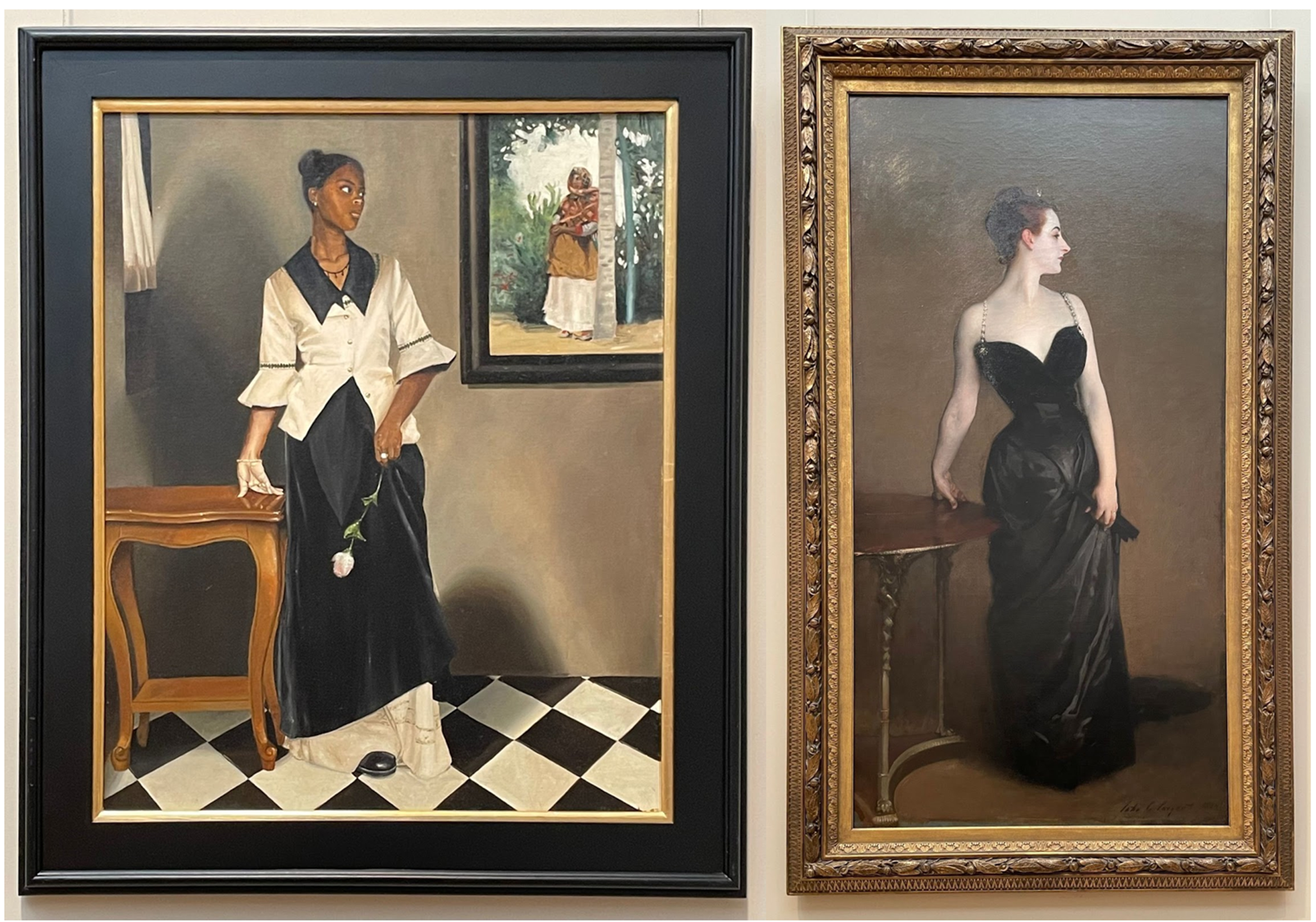
One of my favorite labels that I’ve seen in the past few years was at the Met when I was hunting down John Singer Sargent’s Madame X. Adjacent to Sargent’s painting was Armelle by Elizabeth Colomba. Colomba’s painting is an homage to Sargent’s, which features a Black Creole woman in a pose referencing Madame X.
(left) Armelle, Elizabeth Colomba. 1997. Oil on canvas.
(right) Madame X (Madame Pierre Gautreau), John Singer Sargent. 1883–84. Oil on canvas.
Next to the artwork is a label where Colomba gives further context about the connection between the two works.
After reading Colomba’s perspective, my delight in seeing these two paintings together grew. I love when artists reference past works in new ways that bend the original work’s message or ideals. Thanks to Colomba’s quote, I could share these new, interesting details about Gautreau’s life with my friend when we came across Sargent’s Madame Gautreau Drinking a Toast at the Gardner Museum.
In a 2022 Visitor Studies Journal article, Luise Reitstätter, Karolin Galter, and Flora Bakondi described their research observing visitors interacting with labels at the Belvedere Palace in Vienna, Austria, using Mobile Eye Tracking (MET) technology. The study focused on:
1. How do visitors differ in reading affinity?
2. How do visitors combine looking at art and reading labels? and,
3. How do visitors remember artworks in relation to label information?
They found that “if text is provided, visitors will use it,” and “labels of potential value to visitors offer information that an artwork itself cannot give.” Yes, some visitors read more than others and have higher levels of engagement, but overall, visitors want to know more about what they’re looking at!
An engaging label is also important to help catch visitors’ attention. I think of the American Alliance of Museums’ Excellence in Exhibition Label Writing Competition— although it hasn’t been held since 2021, looking at past winning labels is an excellent resource for label writing inspiration. I am also reminded of a past visit to the National Museum of the American Indian in New York, where the labels in its permanent exhibition, Infinity of Nations, include small illustrations of the objects next to the object descriptions. This small addition helped me identify what objects I was reading about rather than guess, and it’s a feature that I still think of when visiting similar historical museums.
(Left) A picture of a Mapuche horse effigy vessel and its accompanying label.
(Right) A picture of a Sauk bowl and its accompanying label. The labels feature a simple drawing of the objects next to their accompanying text.
Overall, I understand why the Gardner Museum lacks labels, yet I still believe labels continue to play a crucial role in enhancing the visitor's experience by providing necessary context and information about the objects they are viewing. While writing this blog post, I had a great time reminiscing about some of my favorite labels that I have come across over the years and my excitement for labels has grown as I think about all the unique and interesting labels that I have yet to see in the future.
Keep making good labels—I love reading them.


