Improving Our Museum Labels Through A Harm Reduction Lens: Part 2
By: Rachel Nicholson
In my last post, I wrote about harm reduction as a philosophy and how it might be applied to rethinking museum labels. In this post, I’ll explain just how we started these conversations at the Nelson-Atkins and put our ideas in action.
This project is on-going, and we have certainly stumbled along the way, but central to our process has been a commitment to collaboration and shared learning across our institution. While the three of us working in Interpretation could have identified problematic labels, taken them down, and swapped them out for new ones relatively quickly, we saw this as an opportunity to build common language around harm across the museum and collectively imagine new guidelines and principles for our interpretative text.
To deepen our learning and ensure we included diverse voices and experiences in the process, we invited staff members who do not traditionally work on labels to our conversations and workshops. By asking for perspectives from colleagues in the Public Programs, School and Educator Programs, Visitor Services, and Design departments (to name a few) at different points in this process we broadened our understanding of how different people can experience a work of art and its accompanying label. Many of our colleagues outside of Curatorial and Interpretation are also personally members of groups that may have experienced harm in museums.
What do we mean by harm?
Step one, which took place from June to August 2020, was to identify what we at the Nelson-Atkins mean by harm in language and how we see it manifesting in our existing labels. To achieve this, we met with Curators, Interpretive Planners, and members of our Community and Access and School and Educator teams. Dividing into breakout rooms, we started with the question “How can art museum labels do harm?”
This broad question led to a specific list of ways labels can cause harm, including:
Assuming a generalized experience of the world, that the white male is the basic human experience, that whiteness is the norm
Subjective judgements or comments on physical appearance or value judgements on beauty without historical context
Passive voice sentence construction that generalizes or avoids naming an offender
Vocabulary and terminology that reinforces hegemonic power and exclusionary white narratives (e.g., Exotic, Discover, Westward expansion and progress)
Non-people first language; language that puts a social identity before the person
From this initial conversation, we asked our Curatorial colleagues to mine the permanent collection galleries and identify labels they’d like to replace, based on our agreed upon list of what can cause harm in labels. Not surprisingly, their critical examinations necessarily broadened our definition. The list below shows the additional types of harm they identified.

Our list of all types of harm identified by curators across collections.
Working off their notes, we in Interpretation mapped the types of harm cause by labels across different permanent collections. This reinforced the notion that strategies for improving our labels can be implemented across the museum, rather than department by department. As visitors tend to not think about collections separately but rather wander between galleries, we needed to think about our approach to labels and harm holistically.
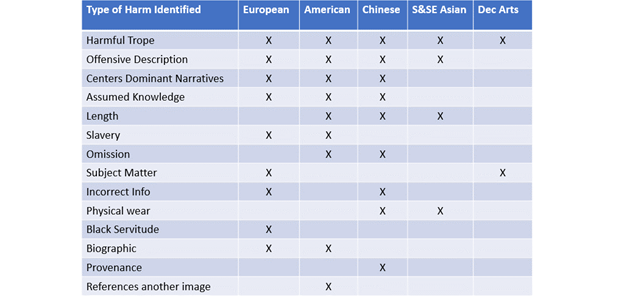
Our chart of the types of harm showing how they mapped across our collections.
In grouping types of harm, we also realized we could broadly place “harm done by label language” into two main categories: what we say and what we don’t say. In our next step, we chose to focus on these two arenas, acknowledging that accessible fonts and design were also necessary pieces for improving the gallery experience for all visitors.

Our diagram showing the overlap between how language can cause harm, the major focus of our label workshops.
The Challenge of Collaborating While Working Remotely
To continue this conversation of harm cause by labels across our collections, our team organized cross-divisional label workshops. We paired Curatorial departments and chose a problematic label from each, one dealing with harm through omission and one dealing with harm through explicit language.
Working again in small groups of two Interpretive Planners (one facilitating and one taking notes) and with four to six Curators, we used Google Docs to collaboratively edit in real time and ask questions of the current labels, first identifying the harm together and then imagining how we might rewrite the labels. Our format was simple: identify harm individually through collaborative editing, then ask questions of the object and its label, first as a visitor and then as an “expert.” While working remotely has made it hard to have creative meetings like this, a tool like Google Docs helped us create a sense of shared work and brainstorming that is often missing from video meetings.
We used Google Docs to collaboratively edit in real time with colleagues.
Grounding each workshop in specific example labels proved very useful. These conversations about how we improve labels can get abstract very quickly. Being able to all focus on a single label at a time, agree on how we saw harm in the label, and then imagine something new helped us focus. The collaborative editing also added an element of fun and experimentation by creating a shared activity even though we were not physically in the same room.
The workshops proved so effective that our Director, upon hearing about them, asked to be included. Organizing around a shared activity helped create horizontal communication. Our Director jumped in and was able to share his own thoughts on improving our labels as well as hear how colleagues were thinking through the process.
Identifying Patterns and Principles
From these workshops, groups consistently came back to the question of “What can cause harm?” Across conversations, we began to recognize patterns including over-generalization, oversimplification, and simply trying to say too much could lead to, in the worst case, harmful labels or, in the best-case scenario, boring or unhelpful labels.
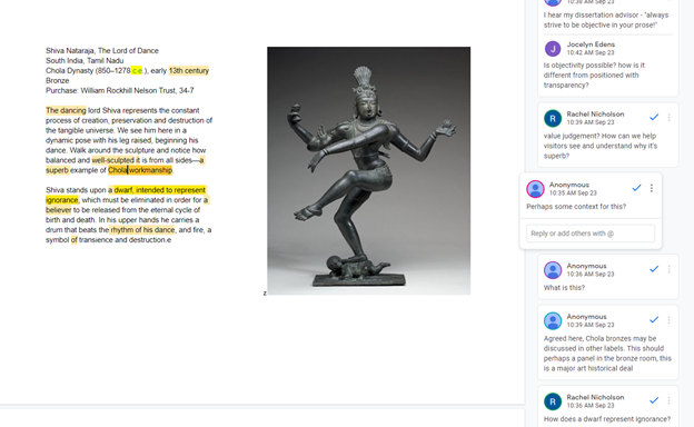
For instance, in the above example the sculpture, from our Southeast Asian collection, was referred to as a “superb example of Chola workmanship” and yet we never gave evidence for why it is a superb example or even what Chola workmanship is. Not only does the label assume knowledge from the visitor, it is general and does not really tell us anything about this particular Chola Dynasty Bronze, thus not doing justice to a legacy of art-making and cultural tradition.
The label was originally identified as harmful because it equates a “dwarf” with “ignorance.” Once we began discussing the object as a group, we realized we could go beyond correcting this harmful language and explore the most interesting pieces of this sculpture, information we were not providing in the current, over-generalized label.

Our workshop on our current Gauguin label helped us focus on the kinds of stories we might tell and how we could reorient the label to be about the subject rather than the artist.
In another case, as we discussed a label for Paul Gauguin’s Faaturama that referenced France’s colonization of Tahiti but did not explicitly mention Gauguin’s role in this power dynamic, we identified just how much space was wasted with general terms and passive voice. We realized that we could do much more in 90 words if we used direct and specific language to name violent and harmful histories.
Beyond using passive voice, the label also entirely focused on Gauguin, removing any discussion of the female subject of the painting. Through omitting her story, the label was reinforcing the power dynamic between Gauguin and his Tahitian subject. What if, we asked, we rewrote the label from the perspective of the woman, inviting visitors to reflect and consider why we know so little about her. While we often want to share the information we have (in this case information about Gauguin), this could be an opportunity to invite new, unresolved interpretations of the work, perhaps ones that create more questions than provide specific answers.
In the next post I’ll explore how these conversations helped us to develop Principles for Interpretative Text. What if, we asked, a label did not present a neat and simple story but rather opened space for further questioning and interpretation by visitors?
About the Author
Rachel Nicholson is the Director, Interpretation, Evaluation & Visitor Research at the Nelson-Atkins Museum of Art. You can reach her at rnicholson@nelson-atkins.org.Every two weeks throughout April and May 2021, Rachel will share her team’s efforts to rewrite the Nelson-Atkins’ permanent collection gallery labels through a harm reduction lens. Read her first post here.